Why Milan's Bike Lanes Don't Work (and How to Measure It)

Introduction
I have been cycling in Milan for about 15 years, since I was a teenager. In that time I have changed seven bikes and fallen more times than I would like to admit. I have also lived and cycled in Paris and in the Netherlands, so I have a fairly concrete idea of what it feels like when a city’s bike lanes actually work.
If you ride a bike in Milan, you know the feeling. You find a nice protected lane, you relax for two blocks, and then it just ends. You are back in traffic, looking for where the next piece of lane starts again, usually on the other side of an intersection and thirty metres to the left.
“Milan’s bike lanes suck” is something I hear (and say) very often. It is a real complaint, but it is also vague. Since I spend most of my time working with graphs and geometry, I started wondering if this feeling could be made precise: can we build a small set of metrics that measure how good a city’s cycling infrastructure is as a network, and then compute them on real data?
The question I am interested in is not “how many kilometres of lane does a city have”. That number is easy to find and, as we will see, quite misleading. The question is: do the lanes connect into something you can actually ride across, or are they a pile of disconnected pieces?
This post describes the method, the results on Milan, Paris and Amsterdam, and a validation on 26 European cities. As usual, it is a work in progress, and I will update it as I improve the analysis.
The Idea: a City as a Graph
My hypothesis was that Milan does not (only) suffer from too little cycling infrastructure, but from badly connected infrastructure. A city can have a reasonable total length of lanes and still be useless to ride if none of it joins up.
To test this, I model the cycling network of a city as a graph $G = (V, E)$:
- edges are segments of cycling infrastructure, weighted by their length in metres;
- nodes are intersections and endpoints, each with a real-world position.
All the data comes from OpenStreetMap. Once the city is a graph, “how well connected is it?” becomes a set of well-defined computations.
Connected components
A connected component is a maximal set of segments you can travel between without ever leaving the cycling network. A perfect network is a single component; a shattered one has hundreds. The raw number of components, however, is a trap: a bigger city simply has more of everything. So I use two normalised quantities.
The largest component fraction is the length of the biggest connected piece divided by the total length of the network:
\[\text{LCC} = \frac{\ell_{\max}}{L}, \qquad L = \sum_i \ell_i\]where $\ell_i$ is the length of component $i$. LCC = 1 means the whole network is one connected mesh; LCC = 0.16 means that the biggest rideable piece is only 16% of the network.
The connectivity index borrows the Herfindahl concentration index from economics:
\[C = \sum_i \left(\frac{\ell_i}{L}\right)^2 \in (0, 1]\]$C = 1$ is a single component, $C \to 0$ is dust. What I like about it is that its reciprocal $1/C$ has a very intuitive reading: it is the effective number of networks the city behaves like, regardless of how many tiny fragments there are.
Where the network breaks
Global scores tell you how bad things are; local metrics tell you why:
- Dead-end density: lanes that stop in the middle of nowhere (degree-1 nodes) per km.
- Small gaps: for each dead end, the distance to the nearest node in a different component. Many tiny gaps mean two pieces that almost touch.
- Bridge fraction: a bridge is an edge whose removal splits the network in two. If most edges are bridges, the network is a fragile tree with no alternative routes: one construction site and you are stranded. A real mesh has few bridges.
None of this is new: it follows existing work on cycling networks (Natera Orozco et al., 2020; Szell et al., 2022; Lowry & Loh, 2017). What I wanted was to apply it carefully and see what it says about my city.
A sanity check on a toy example
Before using real data, I checked that the metrics behave as expected. I take a 12×12 grid and randomly remove a fraction $p$ of its edges: more cuts should mean more, smaller pieces.
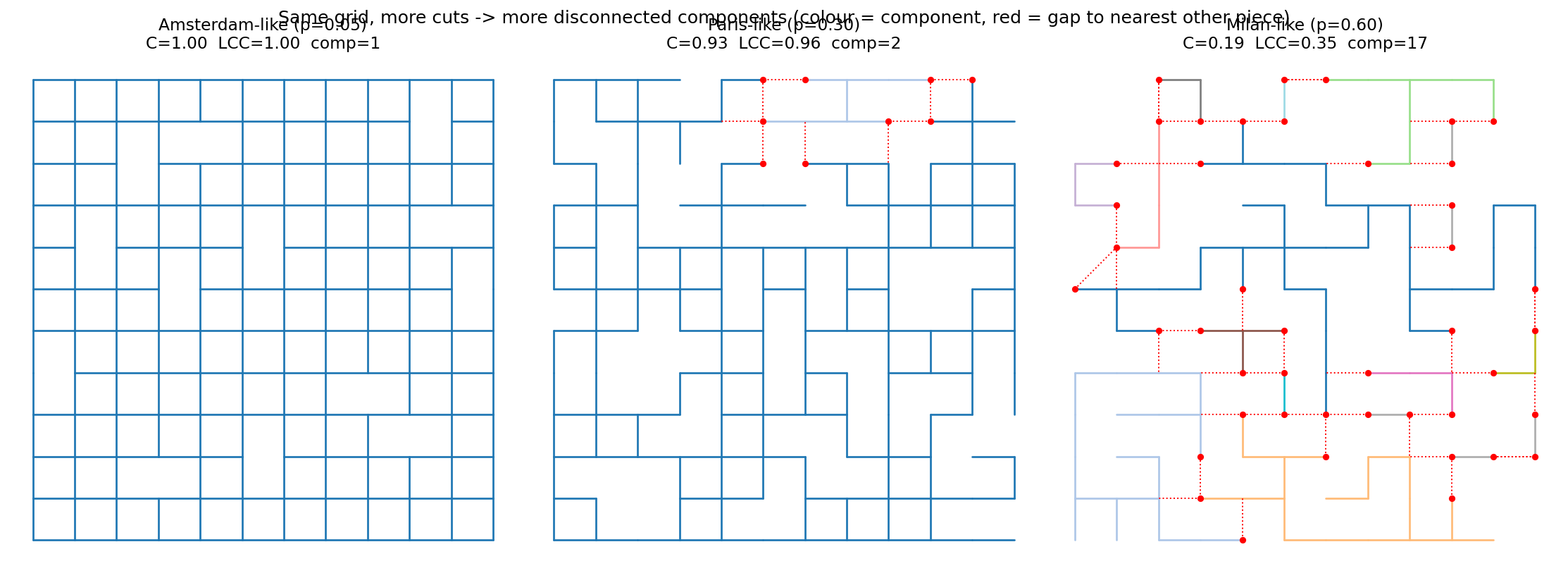
| $p = 0.05$ | $p = 0.30$ | $p = 0.60$ | |
|---|---|---|---|
| components | 1 | 2 | 17 |
| LCC | 1.00 | 0.96 | 0.35 |
| $C$ | 1.00 | 0.93 | 0.19 |
| effective networks $1/C$ | 1.0 | 1.1 | 5.2 |
| bridge fraction | 0.00 | 0.17 | 1.00 |
The metrics clearly separate the three regimes. At $p = 0.60$ the grid collapses into 17 pieces and every remaining edge is a bridge: a skeleton with no redundancy at all.
Milan vs Paris vs Amsterdam
For a fair comparison, I take the dedicated cycling layer within a 6 km radius of each city centre. Using a fixed disc instead of administrative boundaries means we compare the same area for every city.
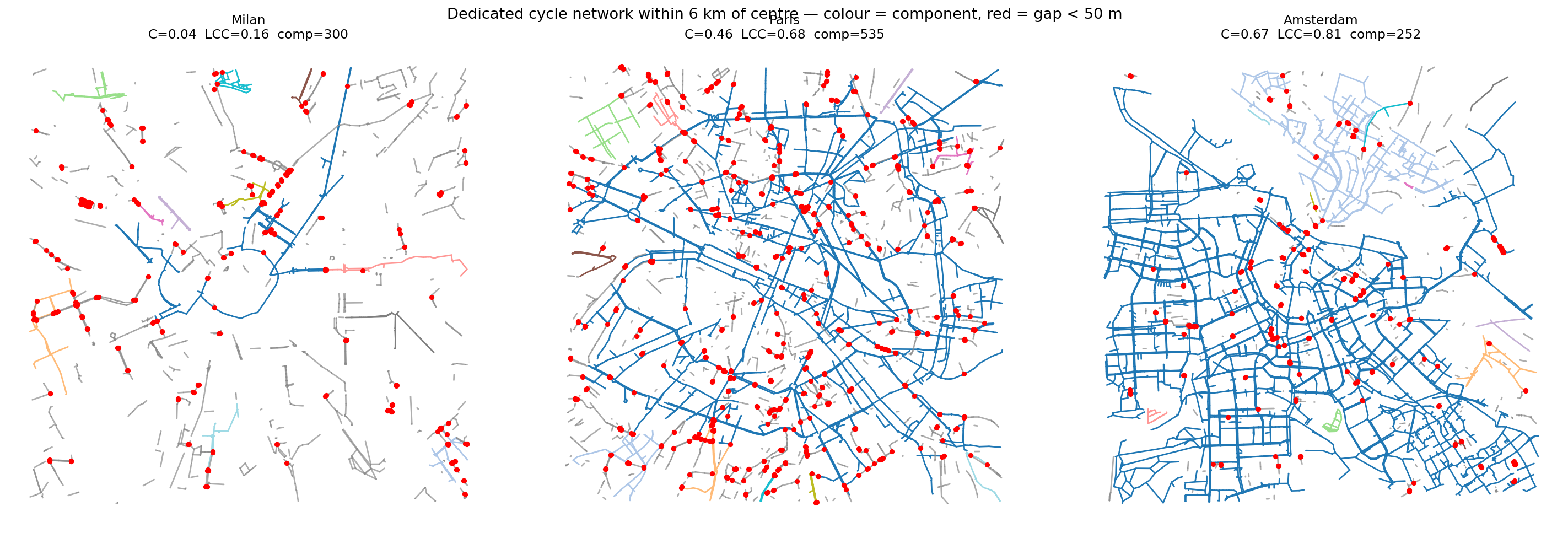
I think the picture speaks for itself. Paris and Amsterdam are dominated by one large blue mesh spanning the whole area. Milan is confetti: a scatter of small fragments, with red gap markers everywhere.
| Milan | Paris | Amsterdam | |
|---|---|---|---|
| total length (km) | 260 | 639 | 725 |
| components | 300 | 535 | 252 |
| LCC | 0.16 | 0.68 | 0.81 |
| connectivity $C$ | 0.04 | 0.46 | 0.67 |
| effective networks $1/C$ | 28.3 | 2.2 | 1.5 |
| components per km | 1.15 | 0.84 | 0.35 |
| median small gap (m) | 35 | 56 | 75 |
| bridge fraction | 0.67 | 0.54 | 0.27 |
A few observations:
Milan is shattered, not just smaller. In Amsterdam 81% of the network is a single connected piece, in Paris 68%, in Milan only 16%. According to the connectivity index, Milan behaves like ~28 independent mini-networks, compared to ~2 for Paris and ~1.5 for Amsterdam. Milan also has fewer kilometres, but the connectivity gap is much larger than the quantity gap.
Counting components is misleading. Paris has more components than Milan (535 vs 300) and is still far more connected, simply because it has 2.5 times more lanes, almost all attached to one big mesh. This is exactly why the normalised metrics are needed.
Milan’s gaps are tiny. The median gap between pieces in Milan is 35 m, the smallest of the three. Lanes stop metres away from the next lane. To me, this looks like the fingerprint of building infrastructure street by street, one project at a time, without anyone responsible for stitching the pieces together.
There is no redundancy. Two out of three edges in Milan are bridges, against about one in four in Amsterdam. Every link is load-bearing, which is why even the existing lanes feel fragile: one blocked segment and you are back in traffic.
Is It Really That Bad? Adding Traffic Stress
At this point I had a nice, strong result, and also a problem I could not ignore. I was measuring the dedicated cycling layer in isolation, but nobody cycles only on dedicated lanes. People ride on quiet residential streets and 30 km/h zones all the time. A “gap” across a calm side street is not a real barrier. By treating every non-dedicated metre as impassable, the previous analysis overstates fragmentation.
The cycling literature has a standard tool for this, the Level of Traffic Stress (LTS; Mekuria, Furth & Nixon, 2012). Every street gets a score from 1 to 4 depending on how stressful it is to ride, based on speed limit, number of lanes, and type of infrastructure. So I downloaded the full street network, classified each street with a simple and transparent LTS rule, and recomputed the connectivity on three nested layers:
- dedicated: only cycling infrastructure (tracks and lanes), as before;
- low-stress (LTS ≤ 2): plus calm streets that a typical adult rides comfortably;
- LTS ≤ 3: plus busier roads that only confident cyclists tolerate.
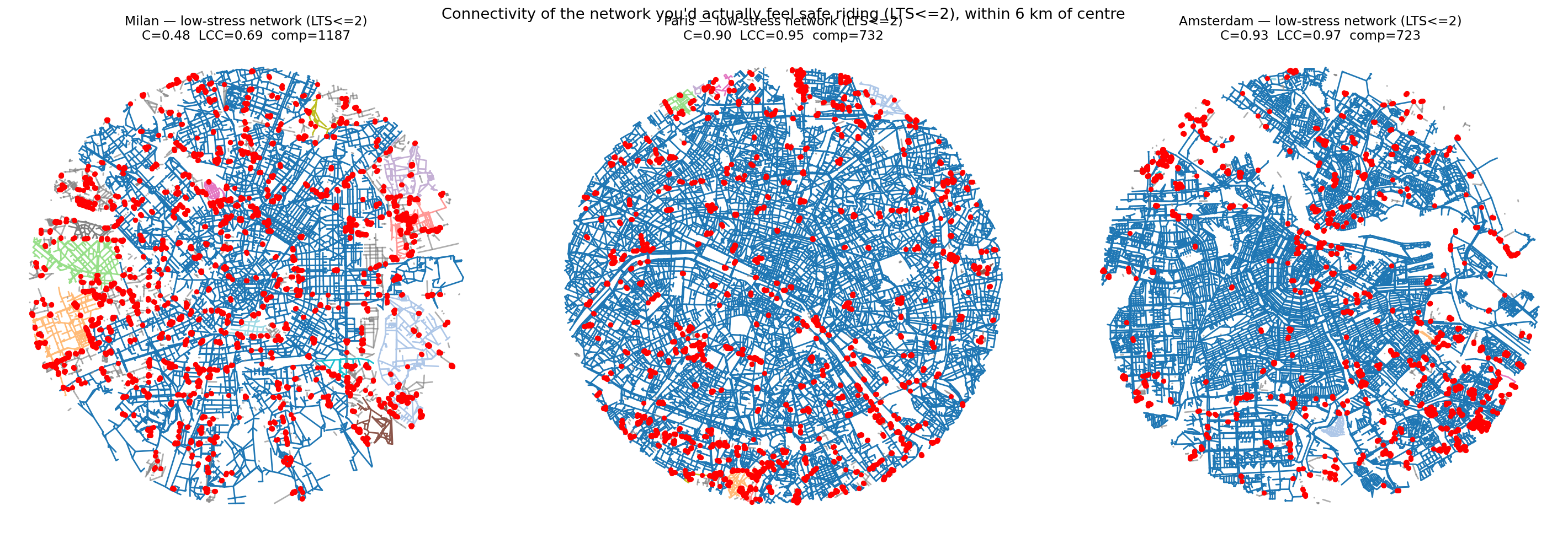
| connectivity $C$ | Milan | Paris | Amsterdam |
|---|---|---|---|
| dedicated | 0.05 | 0.55 | 0.65 |
| low-stress (LTS ≤ 2) | 0.48 | 0.90 | 0.93 |
| LTS ≤ 3 | 0.95 | 0.97 | 0.96 |
(The dedicated row differs slightly from the previous table because it is extracted from the full street network rather than downloaded separately, so the geometry is cleaned a bit differently. The picture is the same.)
This table changed how I see the problem, in three ways.
First, part of the fragmentation was an artefact, and it is fair to say it. Once calm streets are included, Milan jumps from 0.05 to 0.48. The quiet streets do knit a good part of the city together.
Second, the ranking does not change. Even with this more generous model, Milan’s low-stress network is about half as connected as Paris or Amsterdam.
Third, and I think this is the most interesting finding: at LTS ≤ 3 everyone is connected, Milan included. Milan’s network becomes whole only once you accept riding on 50 km/h roads in mixed traffic. In other words, Milan’s fragmentation lives in the safe part of the network. To cross the city you have to trade safety for connectivity. Paris and Amsterdam give you both; Milan makes you choose.
Are the gaps easy to fix?
The tiny gaps looked like good news at first: if lanes stop 35 m from each other, closing them should be cheap. But 35 m in a straight line can mean crossing a railway, a canal, or a four-lane road. So I routed each gap over the real street network and checked its actual length and traffic stress.
| cheap to fix | hard or no route | median detour | |
|---|---|---|---|
| Milan | 23% | 77% | 1.73× |
| Paris | 60% | 40% | 1.00× |
| Amsterdam | 79% | 21% | 1.00× |
Unfortunately, the optimistic reading does not survive. In Paris and Amsterdam the straight line basically is the connection, and most gaps are short, calm links. In Milan only about a quarter of the gaps are cheap to close; the rest are separated by a busy road or a physical barrier. The pieces do not just fail to touch: something is keeping them apart.
Does the Metric Predict Real Cycling?
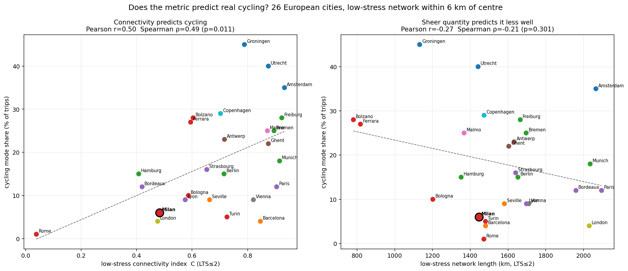
So far I have assumed that connectivity is what matters. A metric is really useful only if it predicts something it was not built from. So I computed the connectivity for 26 European cities and compared it with the actual cycling mode share, the percentage of trips people really make by bike.
| predictor | Pearson $r$ | Spearman $\rho$ | $p$ |
|---|---|---|---|
| dedicated connectivity $C$ | 0.60 | 0.63 | 0.001 |
| low-stress connectivity $C$ | 0.50 | 0.49 | 0.01 |
| low-stress length (km) | −0.27 | −0.21 | 0.30 |
| dedicated length (km) | 0.25 | 0.30 | 0.14 |
Connectivity is significantly correlated with how much people cycle, while the length of the network predicts nothing. Bordeaux, Paris and London all have more low-stress kilometres than Groningen, and a fraction of its cycling. It is not about how many kilometres you build, it is about whether they join up.
There is also a small twist. The best predictor is the connectivity of the dedicated network, the same measure I criticised in the previous section for overstating fragmentation. I think both things are true: the dedicated layer alone exaggerates how fragmented a city is, but across cities it is the clearest signal that a city has seriously committed to cycling.
And Milan? It ranks 22nd out of 26 on low-stress connectivity, and second-to-last among the Italian cities, ahead only of Rome. Turin, Bologna, Ferrara and Bolzano all do better, so this is not just a matter of Italian habits or OpenStreetMap conventions. Milan sits right where the trend line says it should: low connectivity, low cycling.
Of course, the correlation is moderate, not deterministic. Connectivity explains roughly a quarter to a third of the variation, and topography, weather, income and culture all play a role: small, flat cities like Bolzano and Ferrara cycle much more than their connectivity predicts, while Barcelona and Vienna cycle less. Rome, with almost no connected network and almost no cycling, also pulls the trend up. Without it the correlation drops a bit ($\rho \approx 0.42$ for low-stress and $0.59$ for dedicated connectivity) but it is still there.
Final Thoughts
I started with a feeling (“Milan’s bike lanes suck”) and tried to turn it into a measurement, and then tried to break that measurement with a fairer model. It held up, and I think the result is more interesting than the original complaint:
- Milan’s dedicated lanes behave like ~28 disconnected networks, with no backbone and almost no redundancy.
- Counting calm streets helps a lot, but Milan’s low-stress network is still about half as connected as Paris or Amsterdam.
- The city only becomes connected if you accept riding on stressful roads: the problem is concentrated in the safe part of the network.
- Most of the gaps are not cheap to close, because they are held apart by busy roads and physical barriers.
- Across 26 cities, connectivity tracks real cycling, while kilometres of lane do not.
So the problem is connectivity, not just quantity. The lever that matters is not painting more kilometres, but giving the safe network a way across the big roads that divide it: protected crossings and calmed corridors, so that the low-stress islands can merge into one network. Milan already has the raw material, with quiet streets everywhere. They just have not been connected yet. Paris shows that a city can do this in a few years.
Caveats
- OpenStreetMap data quality varies by city, so part of Milan’s fragmentation could be missing data rather than missing lanes. The traffic-stress analysis depends much less on cycling tags, and Milan is still last among the three.
- My LTS classifier is a simplified proxy, not the full official tables. When tags are missing it is generous (it assumes 30 km/h on residential streets), which makes cities look more connected, so if anything Milan’s deficit is underestimated.
- The mode-share figures are approximate: I collected them by hand from EPOMM and municipal surveys, with different years and definitions. This is why I report rank correlations as well.
- Correlation is not causation. Connected networks may encourage cycling, but cycling cities also push for connected networks. The arrow probably goes both ways.
If you have ideas on how to improve the analysis, or data for other cities, I would be very happy to hear from you.
Enjoy Reading This Article?
Here are some more articles you might like to read next: